Case Study
Home Services
Product Design
Overview

Research Insights

Audience
Homeowners
Primarily urban, aged 25–45, smartphone-comfortable
Frustrated by unreliable handymen and lack of accountability
Values
Transparency
Security and trust
Reviews, photos of past work, and fixed pricing

Audience
Handymen
Mostly aged 25–55, with limited formal education
Comfortable with calls and WhatsApp voice notes, not text-heavy UIs
Prefers
Trust by Reputation
familiar interfaces
Visual cues over written instructions
How do we make the handyman app usable for someone with low digital literacy?
Key Questions
What does a homeowner need to feel safe booking through an app?
How do we build trust between two strangers in a transaction-based relationship?
Ideas We Explored

Voice-first navigation
Early on, we considered making the handyman app voice-driven. A button they could press and speak into. We quickly learned this added friction — handymen often work in noisy environments and don't want to speak aloud to a phone on a job site.


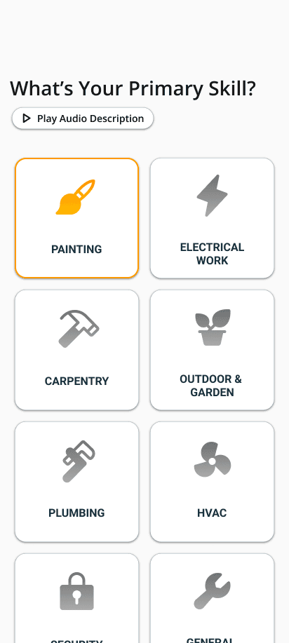
Icon-only interface
We explored stripping all text from the handyman UI and replacing it with large, labeled icons. The insight was that even users who can't read quickly learn to associate icons with actions. We kept this direction, pairing icons with short single-word labels.
How We Prioritized
We used a simple effort vs. impact framework. Features that reduced confusion for low-literacy users and built trust for homeowners moved to the top. Anything that felt clever but added steps was cut.

Design Decisions
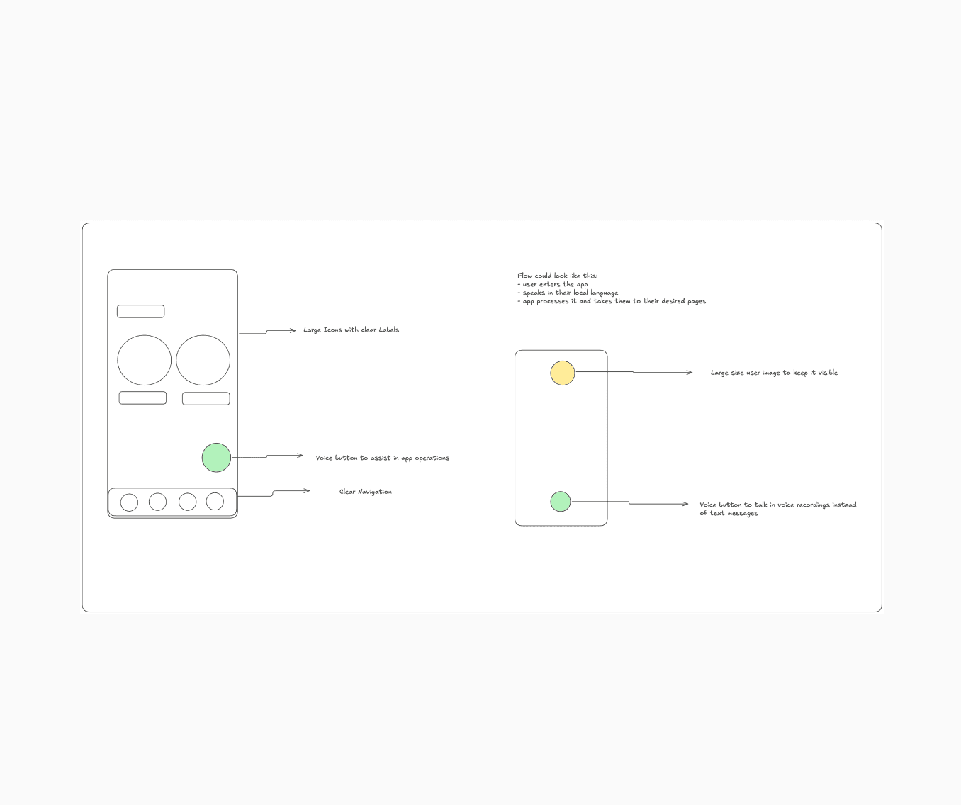
Large Tap Targets Everywhere
Handymen often use phones with damaged screens, or while their hands are dirty. Every tap target in the handyman app was designed to be at least 56dp — well above the 48dp Android minimum. Spacing between buttons was generous to avoid mis-taps.
Minimal Text, Maximum Icons
The handyman interface avoids long sentences. Status updates, actions, and navigation are communicated through icons paired with a single word.
Progressive Disclosure
New handymen see only the most essential screens when they first open the app. Advanced features like earnings history and profile editing are tucked away and revealed gradually. This prevents overwhelm on first use.
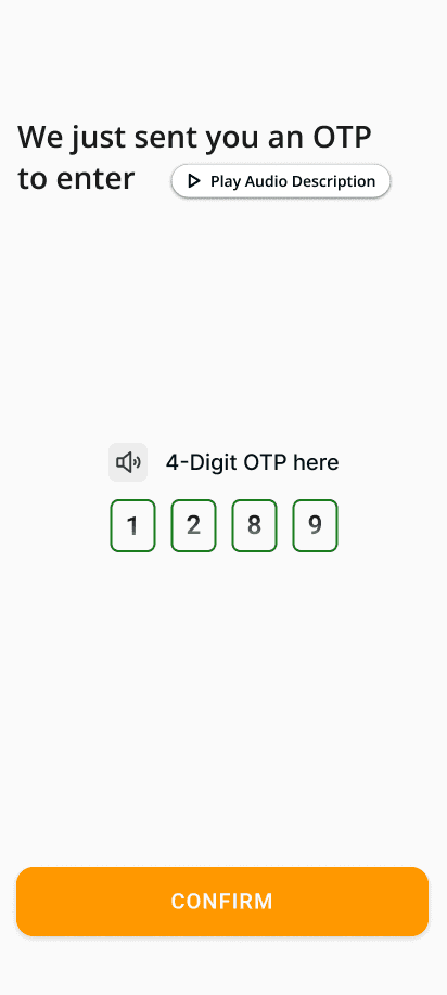
“Speaking icons”, incorporating voice
The handyman side includes audio icons and audio guides in the onboarding and normal booking flow in the language that guide the handyman in their language through the app.
Onboarding Built for the First Timer
The handyman onboarding was designed assuming the user has never signed up for a service app before. Each step has one input, one instruction, and one button. Progress is shown with a simple bar so they always know how far they are.
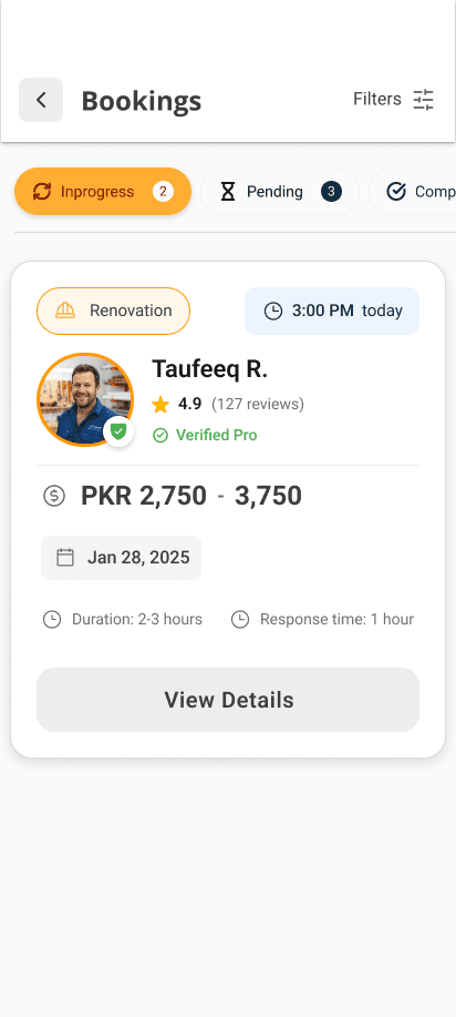
Real-Time Job Notifications
Because handymen may not actively check the app, we designed a job alert system with large, hard-to-miss push notifications. Accepting or declining a job requires just one tap — no navigation required.
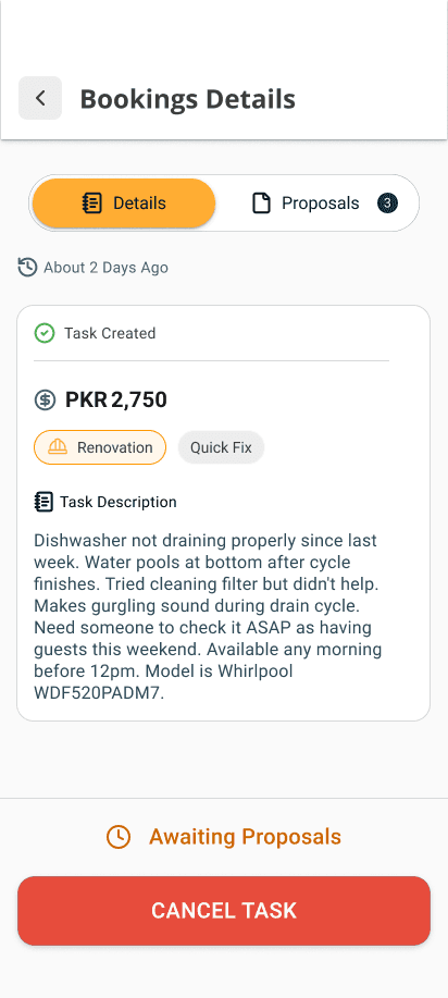
Wireframing

Final Screens


Typography
Roboto
UI Text
Aa
Font Scales (px)
10-12-14-16-20-24-32
Font Weights
#Regular
#Medium
#SemiBold
#Light
Usages in Billions
68.3
Color Palette
Web Orange
#FF9800
Warm Dark
#212529
My thoughts
The work on this project came from my heart as it was a problem that many of daily wagers around me face. The workers in my country are hardworking and honest people who work day and night to give their families the best they can. I wanted to do my part of “thank you” for them, therefore this project is dedicated to them. This project keeps on improving itself day-to-day, every time I see something new that I can incorporate into this project I come back to it and try incorporating it here. This app is one of the works that I am proud of.